I admit it: I’m a font addict. From third grade, when Mrs. Johanson’s handwriting first fascinated me, I fell in love with beautiful letterforms. I practiced calligraphy and careful penmanship for hours, training my fingers to shape letters with care. Today, I can achieve that same elegance with a few clicks on my computer, and a wide range of typefaces brings beautiful handwriting and refined typography into every project I create.
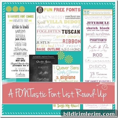
I collect curated lists of bloggers’ favorite fonts and typography combinations. With thousands of typefaces available, these lists make it much easier to focus on the best options for headings, logos, blog titles, and body text. Curated font lists and examples help you see how fonts work together in real layouts and give you inspiration for pairing script or handwritten fonts with clean sans-serifs or classic serifs.
Below are several useful lists and sources I’ve found helpful. Each image links back to its original post so you can view the full list and any usage notes provided by the authors.
Source: Kayla Aimee
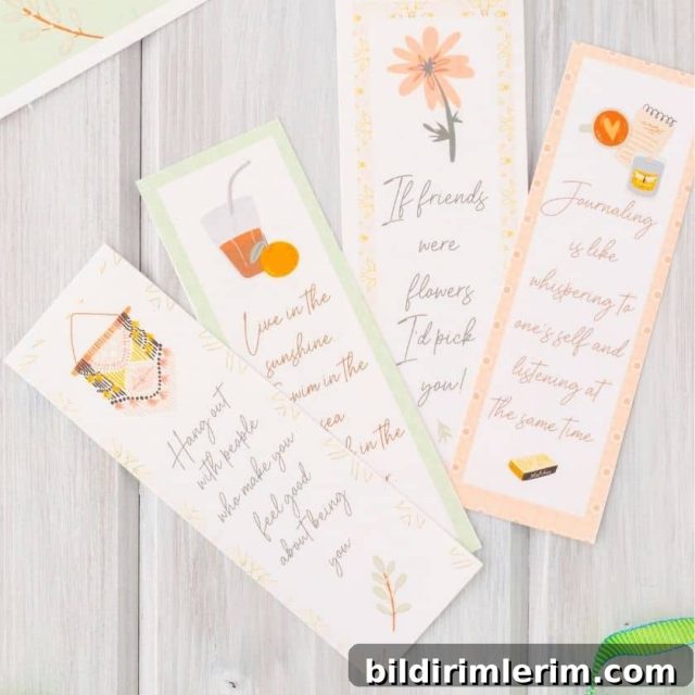
Source: Simply Klassic Home
Source: Peter Loves Jane
Source: House of Smiths
Source: Lovely Little Snippets
If you’re new to downloading fonts, search for guides specific to your operating system—there are clear tutorials for macOS, Windows, and Linux systems. Most free fonts download as compressed “zip” archives. After downloading, you usually need to extract (unzip) the files, then install the font using your system’s standard font manager or by right-clicking and choosing “Install.” Once installed, the new typefaces will appear in your design software, word processor, or blogging platform.
Here are a few practical tips for choosing and pairing fonts for blogs, graphics, and print projects:
- Start with hierarchy: select a strong display font for titles or logos, and a highly readable serif or sans-serif for body text.
- Limit combinations: two to three complementary fonts are usually enough—one for headings, one for body copy, and an optional accent script or display for emphasis.
- Seek contrast: pair a decorative or handwritten font with a neutral sans-serif or a classic serif to maintain readability and visual balance.
- Test at different sizes: what looks great large may be unreadable at small sizes, especially with ornate scripts or narrow display fonts.
- Check licensing: always review the font’s license before using it commercially or embedding it in a product or website.
Fonts are a subtle but powerful way to express personality and set the tone of any design. Whether you favor elegant calligraphy, quirky hand-drawn scripts, modern geometric sans-serifs, or timeless serifs, experimenting with curated lists and real-world examples will sharpen your typographic sense.
What are your favorite fonts right now? Mine change frequently as I discover new lettering styles, pairing ideas, and creative uses for type. If you’re exploring typography for a blog, social media graphics, or printed projects, these curated lists are a great place to begin and to build a useful font library for future work.