
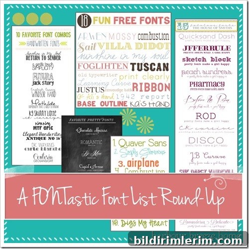
Favorite Fonts: Curated Lists, Pairing Tips, and How to Install Them
I confess: I’m a font addict. Ever since third grade, when my teacher Mrs. Johanson wrote with such graceful penmanship, I’ve been drawn to beautiful lettering. I practiced calligraphy by hand for years, training my fingers to form elegant strokes. Today, instead of painstaking pen practice, a few clicks on my computer produce the same decorative handwriting I admired as a child.
With thousands of typefaces available online, narrowing down choices can be overwhelming. That’s why curated lists from bloggers and designers are invaluable — they highlight favorites, show complementary pairings, and help you discover fresh, usable fonts for personal projects, blogs, and small business branding.
Below are several curated font visuals I’ve collected. Each image links to the original source where the blogger shares details, examples, and sometimes download information. Browse the examples to get a sense of style — script, serif, sans, and display — and click through to learn more from the original posts.
{Source – Kayla Aimee}
{Source ~ Simply Klassic Home}
{Source: Peter Loves Jane}
{Source: House of Smiths}
{Source: Lovely Little Snippets}
Tips for Choosing and Pairing Fonts
Choosing a font is about readability, personality, and the context where it will appear. Consider these practical guidelines:
- Match mood to message: Script and handwritten fonts convey warmth and personality; serifs feel traditional and authoritative; sans-serifs are clean and modern; display fonts add drama for headings or logos.
- Contrast, don’t compete: Pair a decorative or script typeface with a simple sans-serif or a neutral serif for body text. This balances visual interest and legibility.
- Limit your palette: Use two or three complementary fonts across a project—one for headings, one for body text, and an optional accent for small highlights.
- Consider hierarchy: Size, weight, and spacing establish the reading order. Use bold or larger sizes for headings and lighter weights for supporting copy.
- Test across devices: Fonts may render differently on screens versus print. Preview on desktop, tablet, and mobile to ensure consistent readability.
How to Download and Install Fonts
If you’re new to installing fonts, the process is straightforward. Most fonts are packaged in compressed (zipped) files. After downloading, you typically extract the contents and install the font file. On Windows, right-click the font file and choose Install; on macOS, double-click the file and select Install Font. After installation, restart your applications to see the new font available.
Be mindful of licensing: many fonts are free for personal use but require a commercial license for business projects or products. Always check the font’s license or the source page for usage terms before applying a font to a commercial logo, product, or client work.
Where to Look for More Fonts and Inspiration
Curated blog lists, designer portfolios, and font galleries are excellent places to discover typefaces and pairing ideas. Look for posts that show fonts in real-world mockups—on blog headers, business cards, or social graphics—so you can see how a font will perform in context. Save your favorite combinations and build a personal palette that reflects your style and brand needs.
Fonts are a small detail that dramatically affect perception and readability. Whether you favor flowing scripts, crisp sans-serifs, or elegant serifs, exploring curated lists and practicing pairing will sharpen your typographic eye.
What are some of your favorite fonts? Mine keep changing as I find new combinations and fresh lettering styles. Share what you love and how you use fonts in your projects.