
To start the Entryway Gallery Wall project, I selected a simple palette of latex house paints that gave me a beachy, worn aesthetic. The paints included one named Panther and several other cans that were mistints from the paint store — so I can’t provide exact color names for each shade. The combination, however, produced the soft, weathered tones I wanted for the faux frames and the overall entryway display.
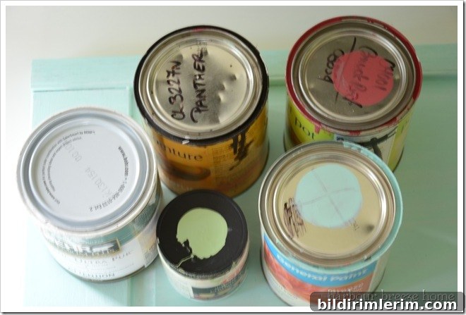
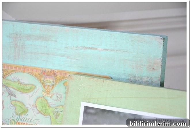
The technique I used is deliberately simple and forgiving, which makes it ideal if you’re new to decorative painting. I began with a clean white base coat on the boards that would become my faux frames. Once that white base was fully dry, I applied the colored top coats. When those colors were almost dry to the touch, I wiped areas of the fresh paint away to reveal bits of the white base beneath. That selective removal creates the subtle distressed, aged look that reads like naturally weathered wood — exactly the effect I wanted for a relaxed, coastal-inspired entryway.
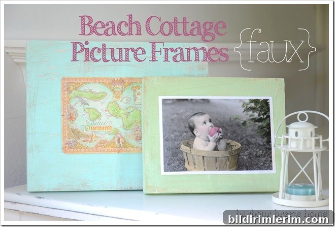
This is an easy, repeatable method: white base, colored top coat, then gentle wiping while the top color is still workable. The areas you wipe down take on a stained, worn appearance that adds visual depth and character to each frame. Because the technique is so forgiving, you can experiment with how much paint to remove until you get the exact amount of distressing you prefer.
For the images inside these faux frames I wanted flexibility, so I didn’t permanently affix photos. If you prefer permanent images, a product like Mod Podge would work to seal photos onto the painted surface. I chose a simpler, removable solution: I attached the printed pictures with a little scotch tape to the back of each frame insert. This keeps the look clean while allowing me to swap artwork or photos whenever I want to update the display.
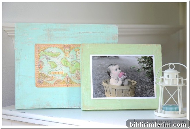
If you’re planning a gallery wall in an entry or hallway, faux frames are a low-cost, high-impact way to introduce texture and color without committing to expensive framed art. The worn-paint technique pairs especially well with coastal, farmhouse, or shabby-chic styles, but it can be adapted to fit contemporary interiors by choosing a more neutral or monochromatic color scheme.
Simple tips to keep in mind: work on a clean, flat surface; apply at least one solid white base coat so the top colors have something to reveal when you distress them; and experiment on a scrap piece before working on your final pieces to judge how aggressively to remove paint. Because many of my paints were mistints, the result is uniquely blended and unpredictable — which I consider a strength for this kind of handmade look.
{See, I told you it was really simple!}
For the Gallery Wall reveal, see the original post mentioned above.
For the Light Reflector Arrow Sign tutorial and the basic painting technique, refer to the painting guide noted earlier in the post.