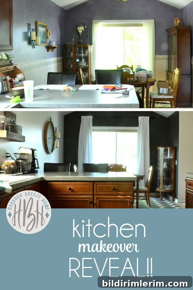
Yesterday I shared a post about how my sister and I tackled a kitchen makeover in just seven days. If you missed that update, here’s a clear look at the transformation and the design choices that made the space feel fresher, larger, and more functional.
Here’s what the kitchen looked like before we began:
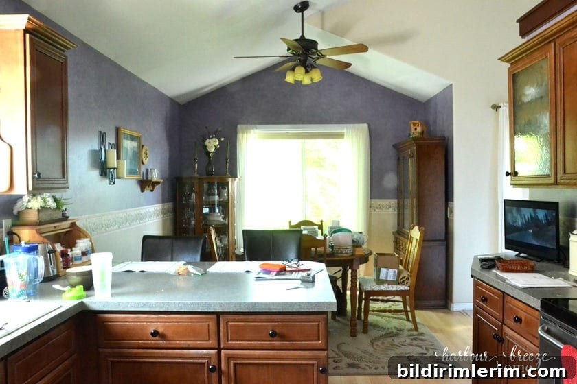
The room has a traditional layout with cherry cabinets and the Dining Room opening off one end. A stacked laundry area hides behind double doors and there’s a closet beside the refrigerator.
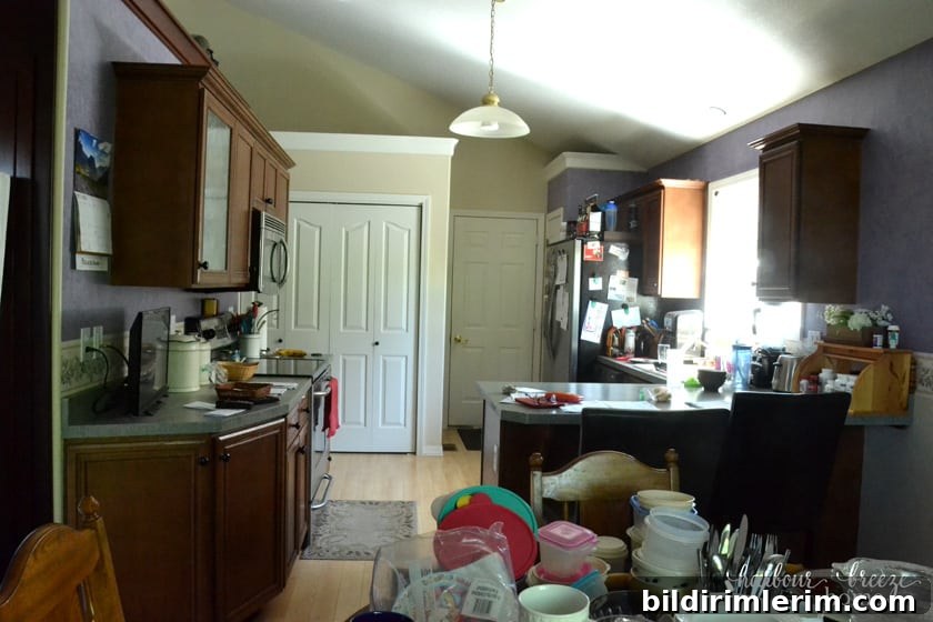
A frequently used pull-up counter creates a casual spot for breakfast and coffee—an important social hub for the family.
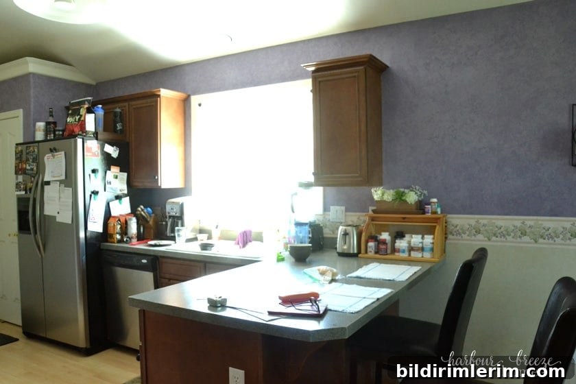
The first step in the makeover was organization: we cleared out unnecessary items and prioritized the things the family actually uses. That instantly freed up storage and made the kitchen feel less cluttered.
A narrow cabinet beside the window held only a few everyday items, so we removed it to create a more open wall. The removed cabinet and an outdated purple sponge paint finish were replaced with a fresh coat of Whitetail by Sherwin Williams, which brightened the area and provided a clean backdrop for new accents.
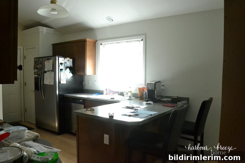
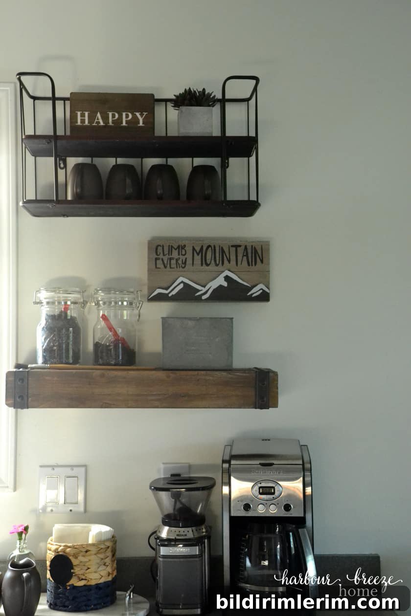
On that freed wall we installed two open shelving units to form a functional and attractive coffee bar. The shelves add visual texture and make frequently used items easy to reach. We picked them up at Hobby Lobby on a shelf sale day, which was a pleasant bonus.
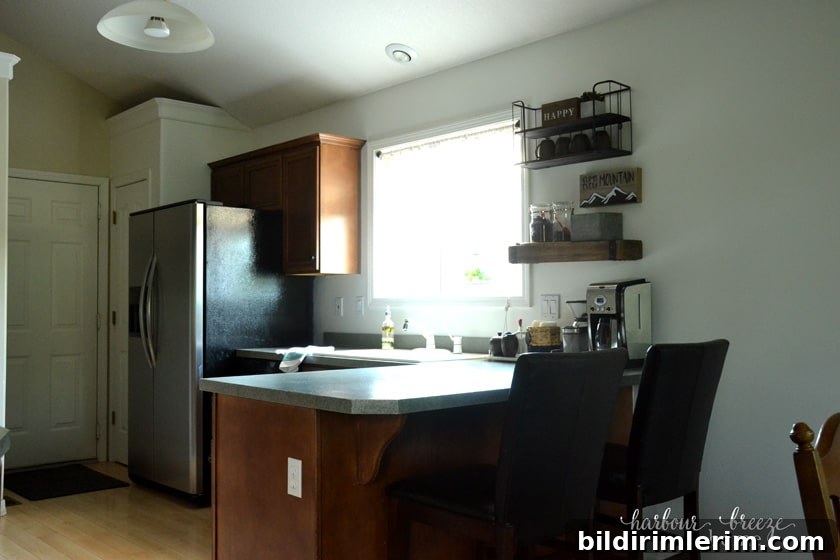 The open shelves brought the character and texture the space needed while keeping everyday essentials accessible.
Removing a bulky china hutch from the Dining Room made a dramatic difference. That single change opened the sightlines between the kitchen and dining area and made the whole combined space feel larger and more inviting.
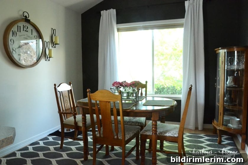
To add depth and a sophisticated contrast, we painted the peak wall in Urbane Bronze by Sherwin Williams. That darker accent wall anchors the room without overwhelming the neutral palette.
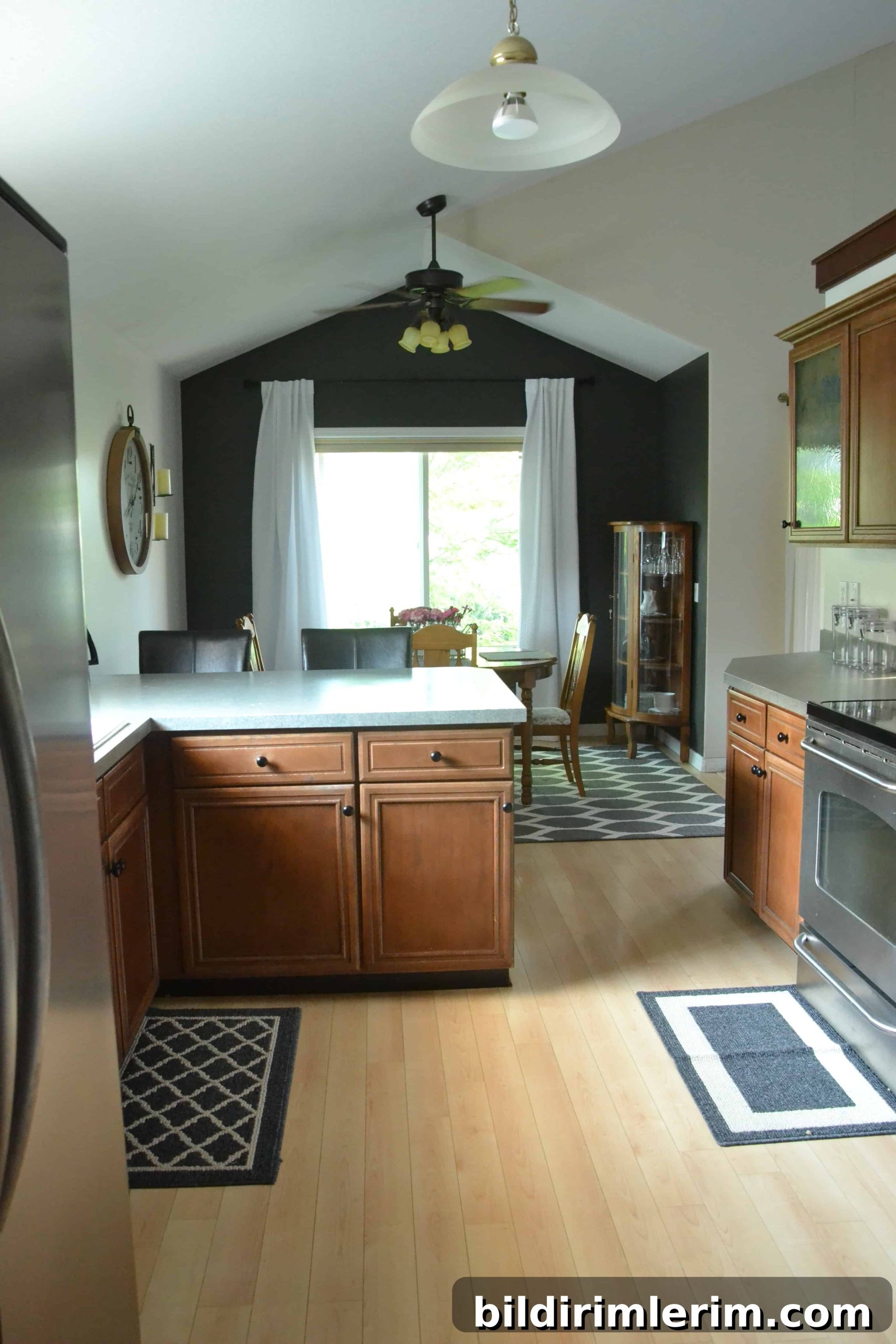
Tall white curtain panels, 96 inches long, visually raise the ceiling and bring an elegant softness to the space. The simple, full-length panels help the room read as taller and more refined.
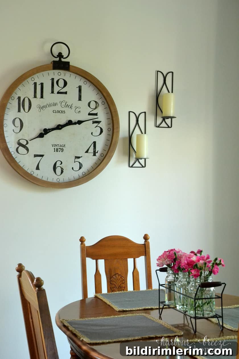
We added a large wall clock to create interest and warmth on the white wall; the clock’s texture complements the new shelving and decor.
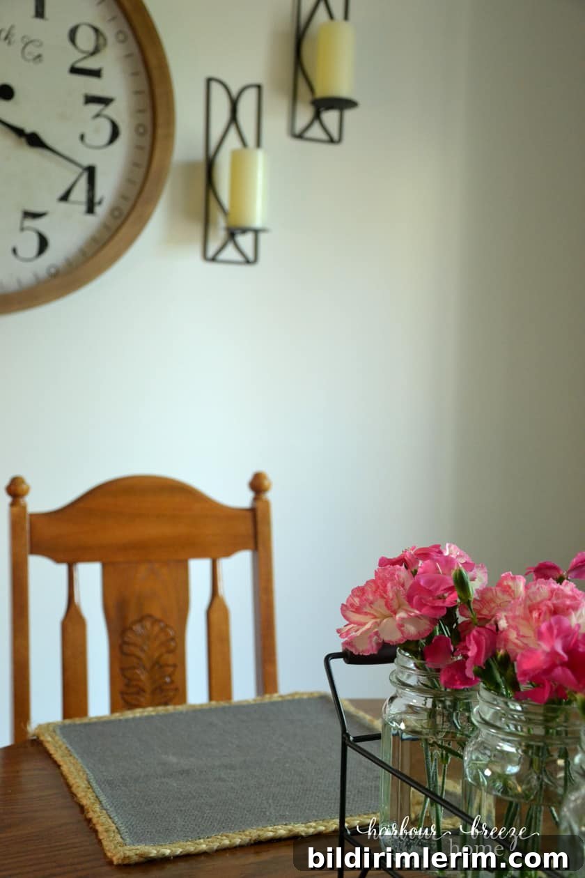
Outdated accessories like old placemats and towels were removed and replaced with coordinated elements to complete the look. Simple square burlap placemats and mason-jar floral vases from Bed, Bath, & Beyond brought farmhouse charm without cluttering the surfaces.
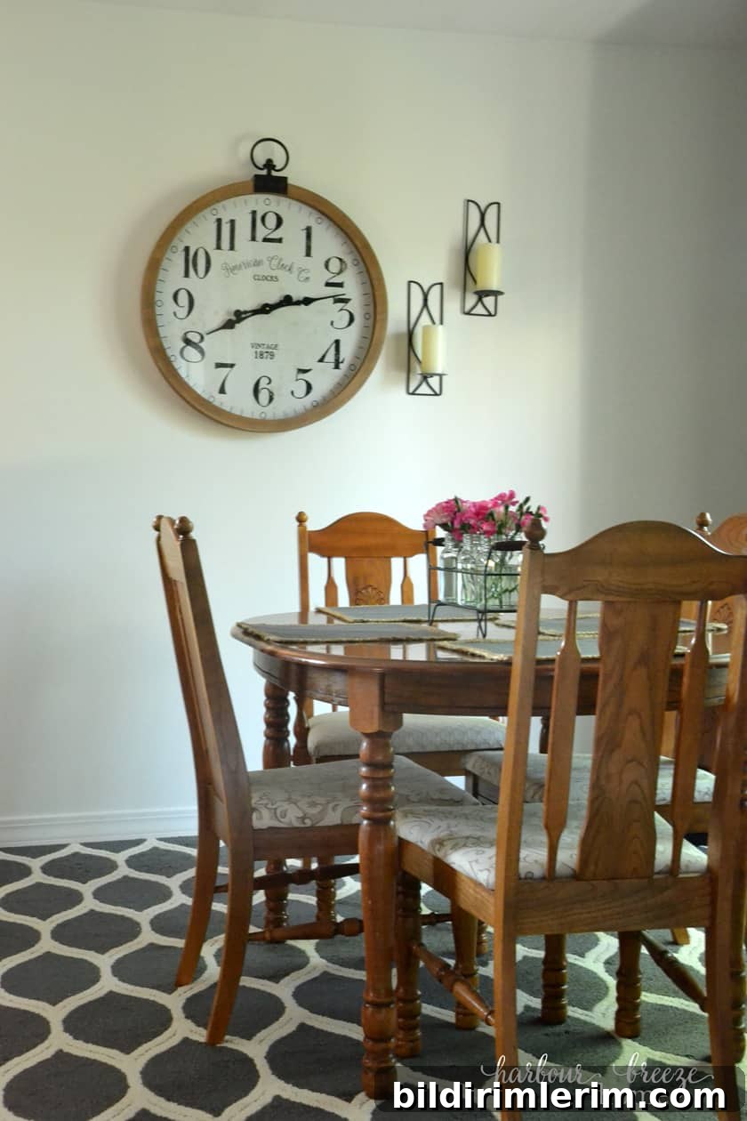
A printed rug from Walmart helped define the Dining Room area and anchored the table with personality and color. Small changes like this rug and coordinated table accessories make a big visual impact.
This kitchen makeover was a joy to work on. The combination of decluttering, fresh paint, smart shelving, and a few well-chosen accessories refreshed the space quickly and affordably.
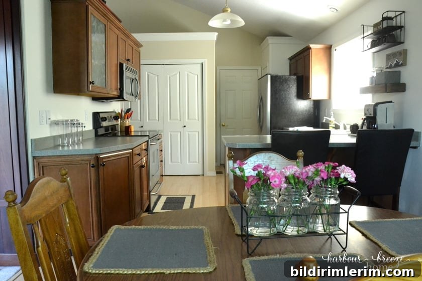
We haven’t finished every detail yet: my sister and I spent an hour on FaceTime yesterday debating countertops and tile choices, so there may be another update to this story in the future.
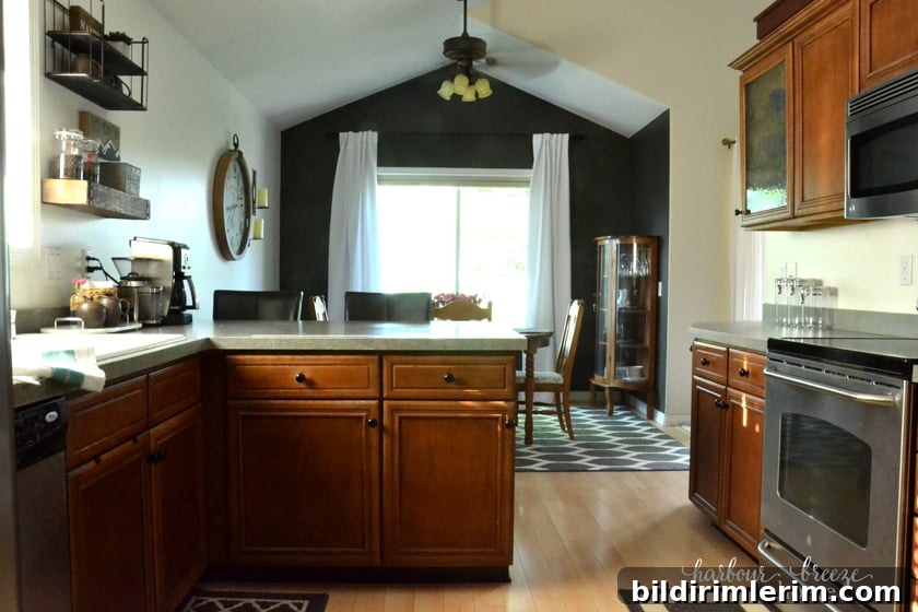
For now, here are some side-by-side before and after photos that highlight the difference thoughtful editing and a few targeted updates can make:
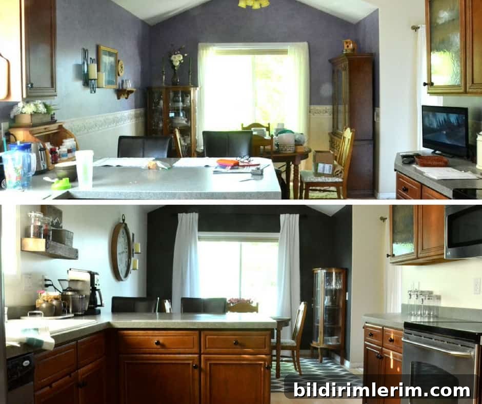
Before & After: View into the Dining Room
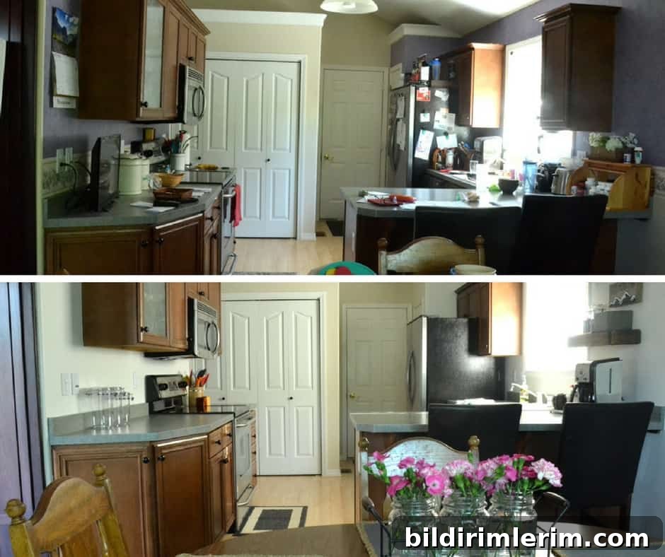
Before & After: View from the table
More Kitchen Remodel Posts
- The $159 small kitchen remodel
- Options for the best paint color for a small kitchen
- Adding kitchen storage with clever organization ideas
- Make your own pendant light for above the sink
- Before and after small kitchen remodel ideas