My entryway and I have had a complicated relationship over the past six years. It’s a very small space, but surprisingly difficult to get right. At first it felt cold and claustrophobic—uninviting the moment the door opened. Over time I experimented with color, texture and layout until the space finally began to feel like part of the home instead of just a passage.
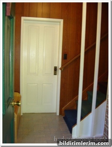
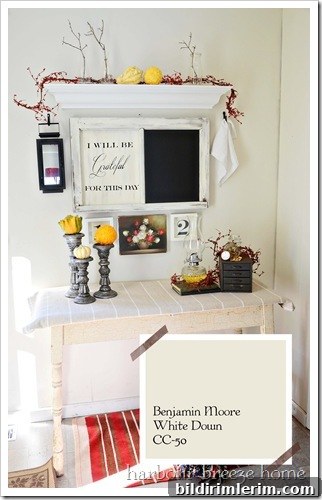
After many paint trials, the entryway settled into a neutral base: White Down by Benjamin Moore. The soft, warm white helped open the space and made it feel cleaner and calmer, but in the darker months it still had a rather moody air. To brighten things up without losing the subtle elegance of the base color, I added a stenciled wall treatment that introduced pattern and personality without overwhelming the narrow hall.
The stencil made a noticeable difference—it added warmth and interest that the plain paint could not. Yet when you walked in the door the overall impression still felt incomplete. The view down the stairway was somewhat static: nice, but a little too restrained. I wanted the entry to feel welcoming, lively and to hint at the personality of the people who live here. In short, I wanted it to be grand in a humble, approachable way.
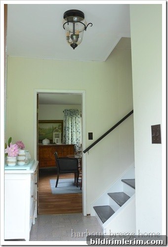
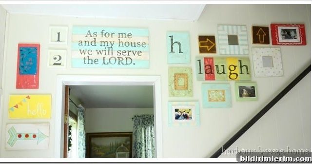
So I pulled out the paints and gathered some reclaimed wood pieces—rescued from a carpenter’s discard pile—and set to work building a gallery wall. The concept was simple: combine different textures, colors, and meaningful words and images to create a focal point you notice the moment you step inside. I painted, distressed, layered and arranged until the composition felt right. The finished wall felt much happier and more inviting—more like an entrance with a story to tell.
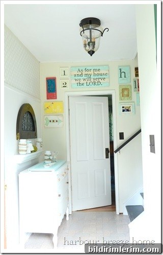
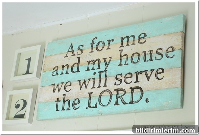
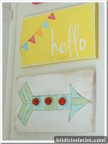
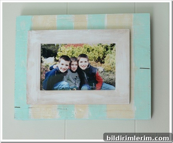
The completed gallery transforms the space. The assortment of painted panels, rustic signs and playful graphics creates movement and warmth. The wall now reads as a collection of small statements—some decorative, some sentimental—that together reflect the home’s character. Large pieces anchor the composition while smaller accents provide rhythm: stripes, polka dots and hand-painted details bring a touch of whimsy and a handcrafted feel.
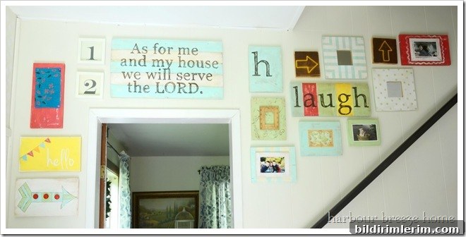
The colors, pictures, textures and words were chosen to embody the people who live here—familiar phrases, rustic finishes and bright accents that say “welcome.” A prominent rustic sign reads “as for me and my house,” while directional arrow signs and cheerful typography pieces add playfulness and character. Stripes and polka dots lend a graphic punch that contrasts nicely with the rougher wood textures.
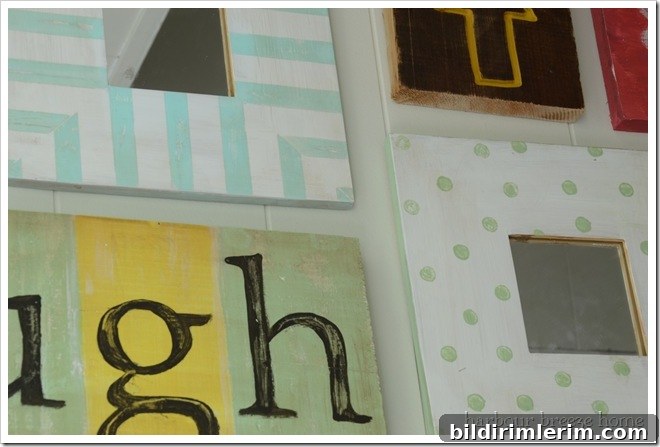
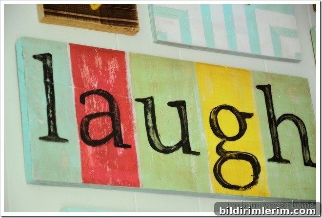
This project turned out to be a lot of fun. The process of combining reclaimed materials with paint and simple graphic elements felt playful and freeing. A hand-lettered “laugh” sign and other small accents help balance the rustic pieces and bring a lighthearted, welcoming tone to the entry.
Overall the makeover brought the entryway to life. It’s now warm, personal and inviting—the perfect first impression for guests and a daily reminder of the home’s personality for those who live here. I’ll be back next week with step-by-step tutorials and more details on how the projects were made, from the stenciled background to the reclaimed-wood pieces and painted signs.
This project was featured at DIY Showoff.