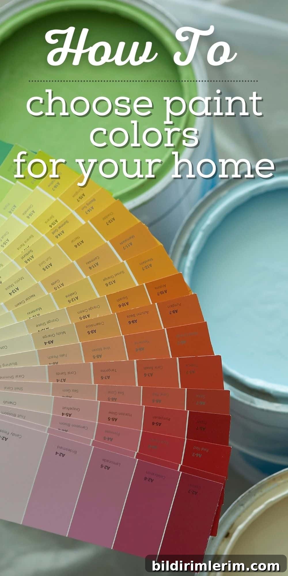
Feeling overwhelmed choosing a paint color for your home? You are not alone. Whether you want a breezy beach atmosphere or the warmth of a coastal cottage, selecting the right coastal paint color can feel like a big decision—but it does not need to be stressful.
Below are practical tips and methods to help you choose colors with confidence, plus a selection of popular coastal cottage paint colors to help you get started.
Why Picking a Paint Color Can Feel So Hard (and How to Make It Easier)
Choosing paint is one of the most transformative steps in updating a room—but it can also feel intimidating. If you have ever stood in a paint aisle unsure which shade of blue to choose, you are far from alone. Lighting, undertones, and room size all affect how a color reads, which is why a methodical approach makes the process much simpler and more enjoyable.
Over the years and through several home projects, I have gathered straightforward, reliable tips for choosing coastal cottage paint colors. These strategies work for any room and help create beachy, calm, and timeless interiors.
5 Tips for Choosing Coastal Cottage Paint Colors
Use these practical steps to guide your color selection and to build a cohesive coastal palette you’ll love living with.
1. Start with What You Love
Before touching a paint chip, gather visual inspiration. Search Pinterest, magazines, and home design blogs and save images of rooms that speak to you. Pay attention to the overall mood: do the spaces feel light and airy, bright and cheerful, or soft and serene? Those emotional cues are just as important as the exact shade.
Tip: Create a dedicated Pinterest board or a photo folder on your phone so you can compare images and spot common themes.
2. Look for Repeating Color Themes
As you review your inspiration images, you’ll likely see certain hues reappearing. For many coastal palettes, watery blues, seafoam greens, soft grays, and warm whites show up repeatedly. Those recurring colors indicate the tones your eye is naturally drawn to and can help you narrow your options.
Decide which family of colors feels right for your home and use that as a foundation for selecting specific shades.
3. Dig Deeper into the Color Tones You Like
If you gravitate toward blue, remember there are countless blues to consider—some are cool and crisp, others are muted or green-leaning. Pay attention to undertones. A shade labeled “gray” may read as blue-green in a specific light, and a “white” may have warm or cool undertones.
When possible, discover the actual paint names used in rooms you admire. The name can offer clues, but always test the color in your own space before committing.
4. Test Paint Colors the Smart Way
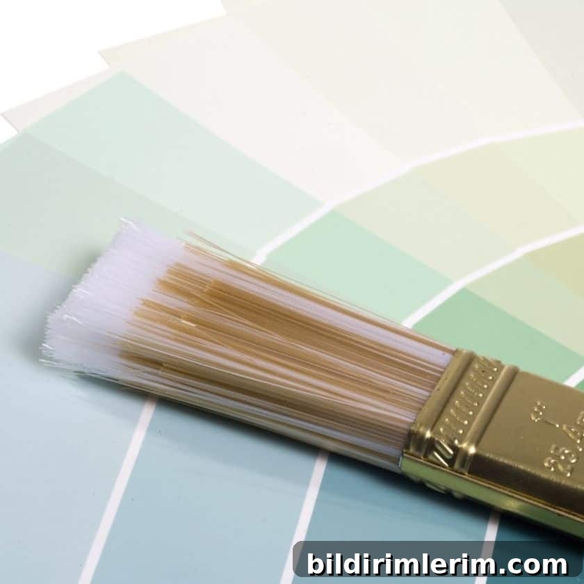
Testing is essential. A sample chip can look very different on a full wall under natural light, artificial light, and in different parts of the day. Use multiple testing methods to be sure a color works in your space.
Three reliable ways to test paint:
- Paint poster boards with sample sizes and move them around the room. Viewing the boards in multiple locations and times of day reveals how light affects the hue.
- Paint swatches directly on your wall in a few vertical stripes. This shows how the new color interacts with the existing trim and base paint.
- Use peel-and-stick samples from paint brands. These let you test without committing and are easy to reposition.
5. Relax—It’s Just Paint
Keep perspective: paint is one of the easiest things to update. If a color doesn’t feel right after a few days, you can paint over it. Even experienced designers change their minds. Treat the process as part of refining your home’s style.
“It’s just paint.”
If you want a place to begin learning more about paints and palettes, plenty of manufacturer resources and color galleries are available for research and inspiration.
Popular Blue-Green Paint Colors for a Coastal Look
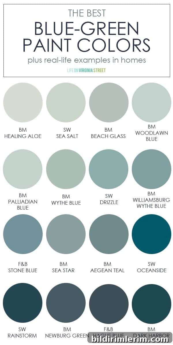
To speed your search, here are commonly recommended blue-green and coastal-friendly neutrals that many homeowners and designers favor for a coastal cottage aesthetic.
Blue-Green and Watery Tones:
- Benjamin Moore Palladian Blue
- Sherwin Williams Sea Salt
- Benjamin Moore Beach Glass
- Benjamin Moore Woodlawn Blue
- Sherwin Williams Rainwashed
Soft Neutrals and Whites:
- Benjamin Moore White Dove
- Benjamin Moore Simply White
- Sherwin Williams Alabaster
- Benjamin Moore Revere Pewter (a versatile greige with coastal appeal)
These shades are popular starting points, but remember to test them in your own rooms to confirm undertones and light interaction.
We used a soft sea-inspired shade in one of our bathrooms and have relied on several of these colors across multiple rooms. Soft, muted coastal hues are timeless and pair well with natural textures like woven rugs, driftwood accents, and white trim.
Want more help choosing the right paint?
- Guides on how to choose a paint color you’ll love.
- Advice on selecting the right paint sheen for each space.
- Step-by-step instructions on how to paint a room effectively.
- Checklists for painting supplies you’ll need for a project.
- Decorating tips inspired by home design professionals.
- Resources to help you compare and select paint colors.
Curious Which Colors We Chose?
If you’d like to see examples from our projects, we share full house color palettes and room-by-room choices that illustrate how colors work together in real homes by the sea.
For More Fresh Ideas for Your Home
Join a newsletter list or a community of fellow home enthusiasts to receive inspiration, printable resources, and project ideas. Subscribing will give you access to art prints, organization templates, planning tools, and exclusive design tips.
For behind-the-scenes updates and project progress, follow designers and home accounts on social platforms where they document real-life room transformations and daily design decisions.